BLOC
Brand, Building + Construction
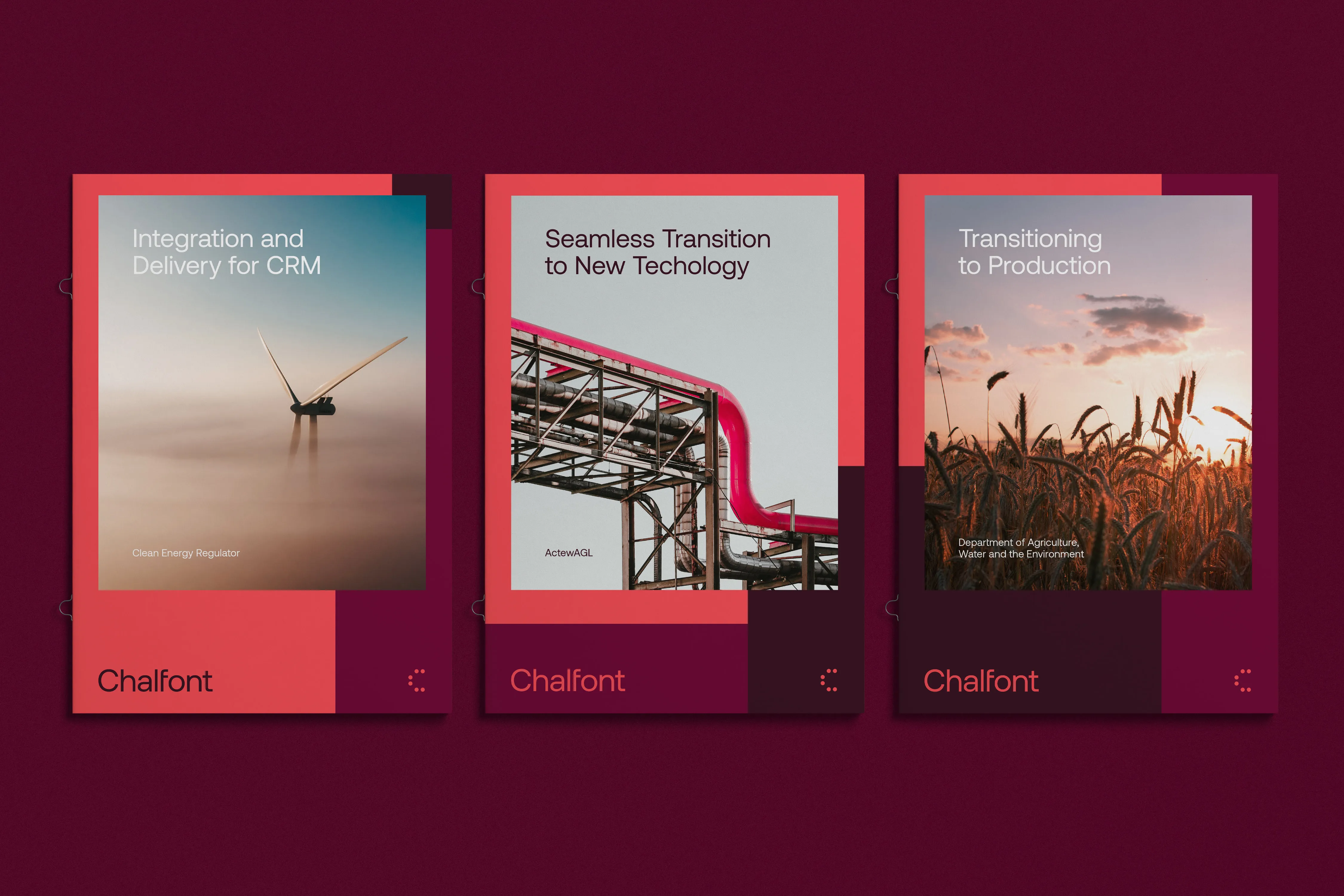
Chalfont Consulting by is a business and technical advisory committed to producing great work for great people. The name, drawn from a cluster of villages in the United Kingdom, reflects the enterprise’s ethos: a collective of diverse, specialised teams, united by a shared purpose and a common vision.
While Chalfont has long taken pride in its people and collaborative culture, the brand identity had yet to reflect that spirit. Swell was engaged to revitalise the brand, to bring clarity and distinction to its presence in a competitive ICT space, while staying true to its people-first approach.
‘Humanising Technology’ is at the core of the new identity. The brand strategy speaks to Chalfont’s mission of simplifying complex systems, and forming unified capabilities across disciplines. This idea is echoed in the wordmark, a ‘C’ formed by distinct ellipses converging to create a singular, confident brandmark.
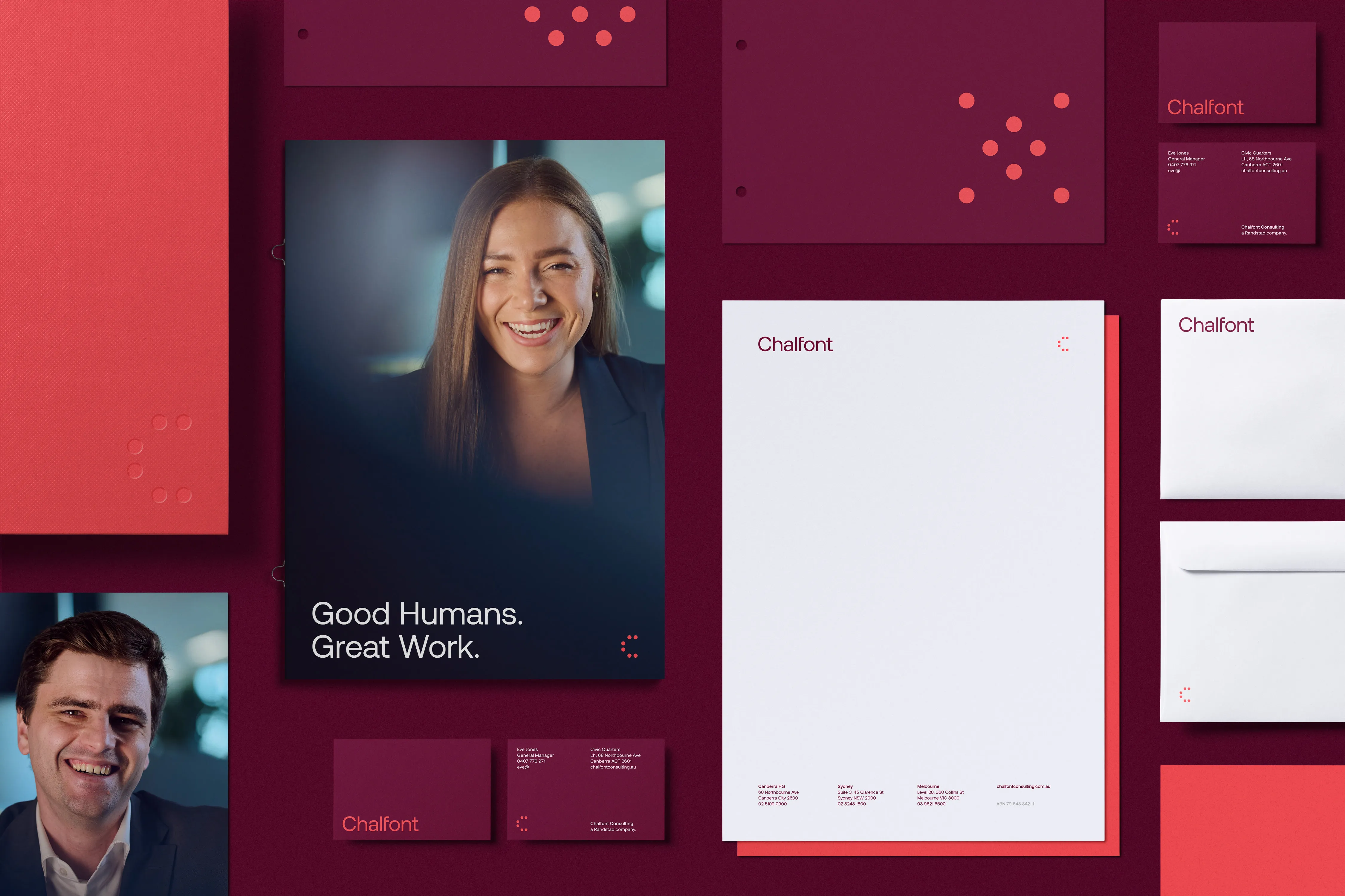
Across the visual identity, people remain central. Photography showcases the real Chalfont team, and a custom icon set, derived from the logo’s grid and geometry, connects brand and capability. A new, energetic colour palette brings warmth and confidence, standing apart from the cold and expected tones that dominate the tech landscape. The result is a brand identity that puts people at the heart of technology.

Swell nailed our brief, making us stand out in the competitive consulting market with awesome creative which highlights the essence of our company – Good humans. Great work. The team were super easy to work with and incredibly accommodating to our changing timelines and needs.
An underlying grid serves as the foundation for all compositions. This ensures a uniform visual language while offering remarkable flexibility, allowing designs to adapt seamlessly to various formats and needs.


You’re viewing the SWELL website on an outdated browser. Please upgrade for the full experience .
Swell is a brand and digital studio.