Hive
Brand, Property + Real Estate
The best brands never stand still.
Terracon Legal has enjoyed growth and success since its inception and is about increase its offering. Now is the ideal time to refresh the brand identity to ensure it stays relevant moving forward.
The existing identity has successfully established brand equity in the market, however it no longer reflects the sophistication of the organisation.
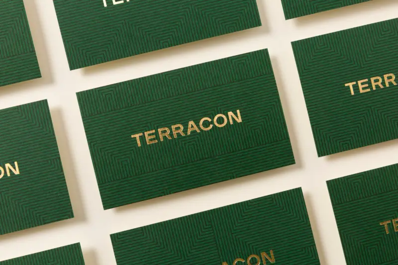
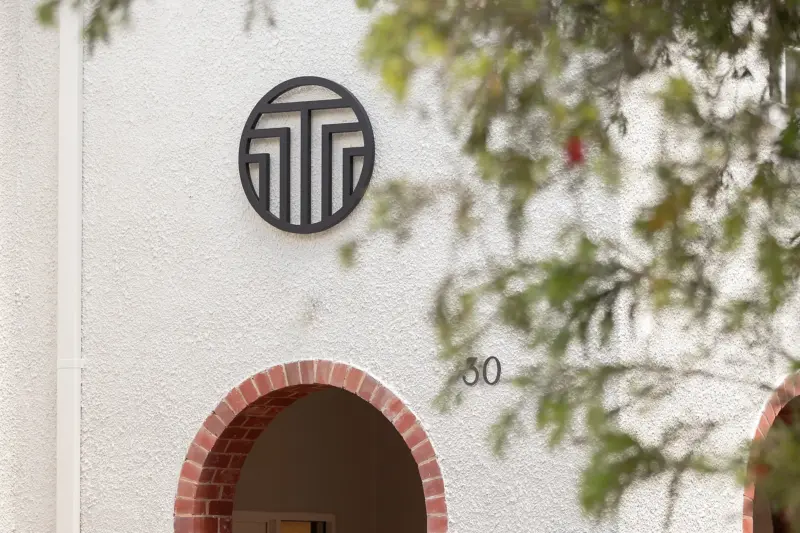
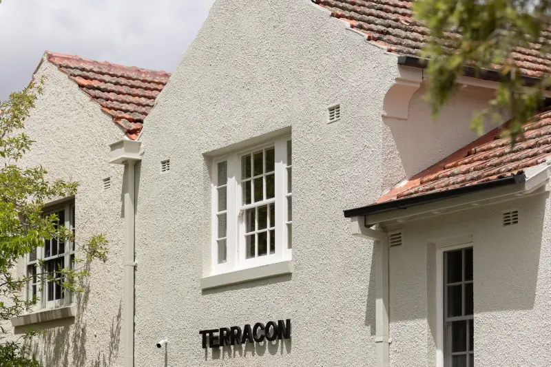
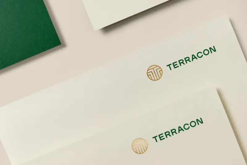
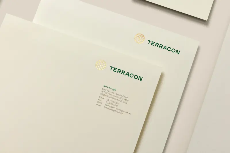
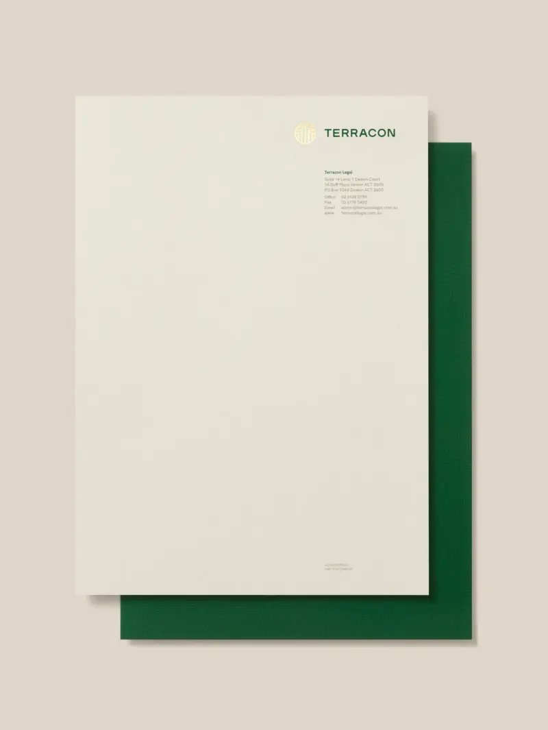
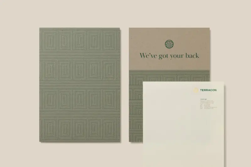
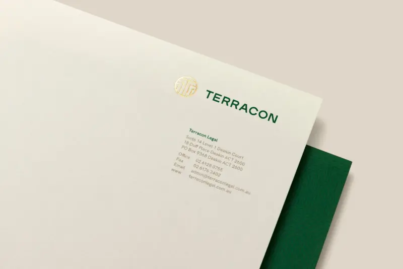
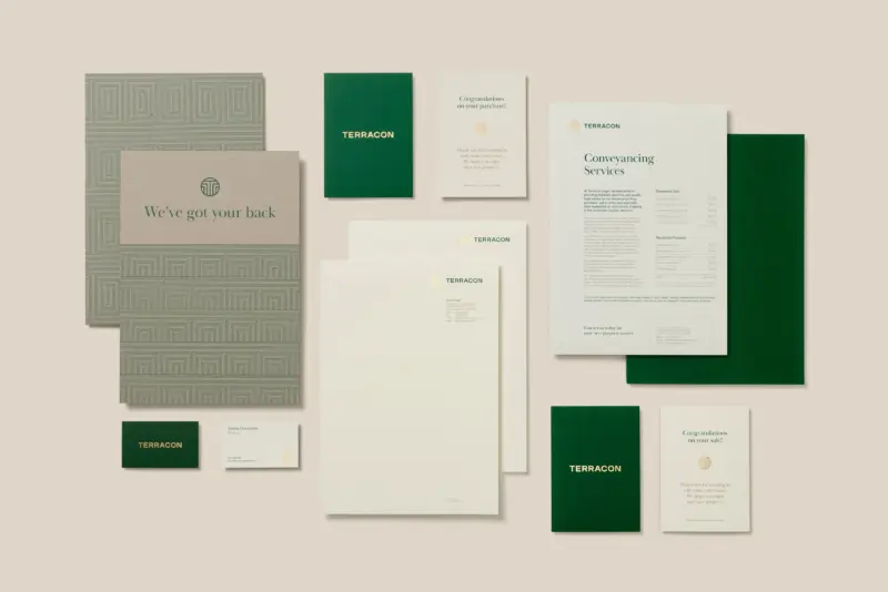
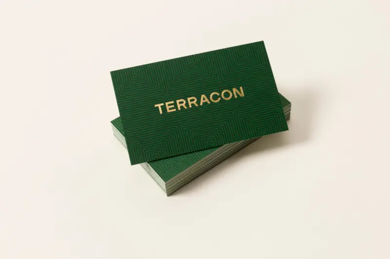
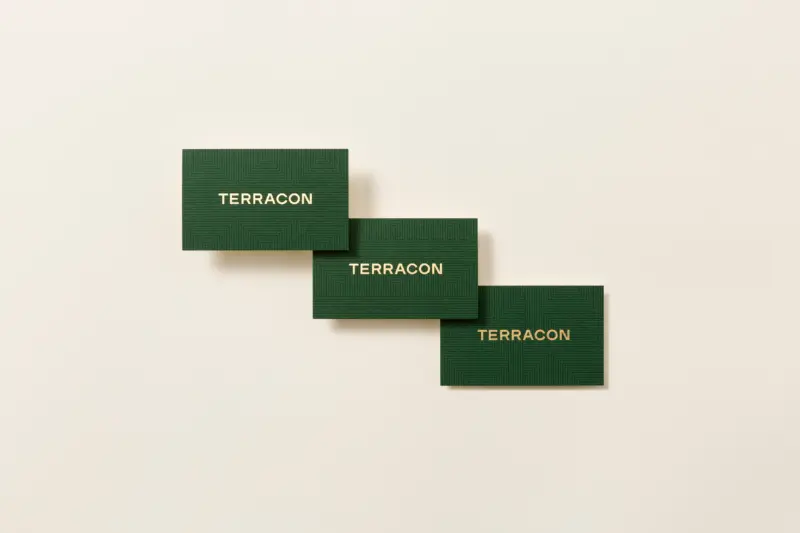
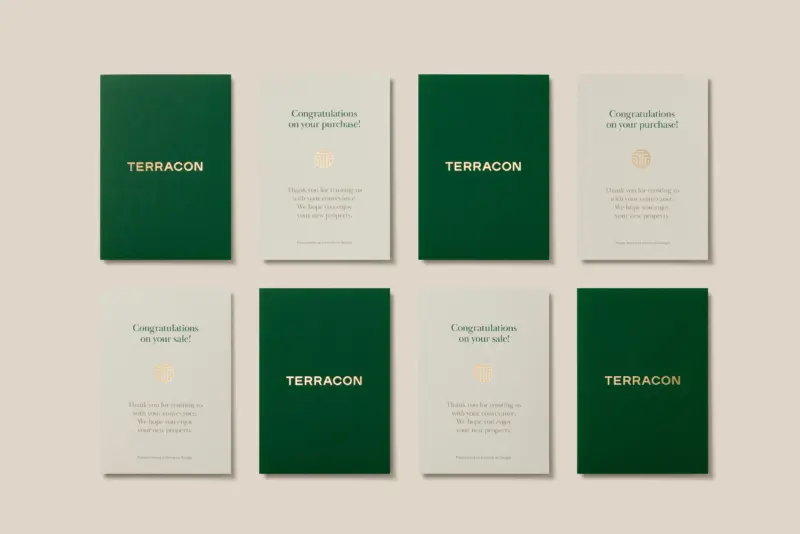
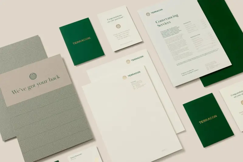
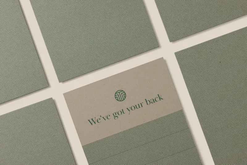
By updating the wordmark to a strong sans-serif and activating the ‘T’ icon through a series of brand patterns, the brand aesthetic is now aligned with the level of service you can expect from Terracon Legal.
..
The best brands never stand still. After years of growth and success since its inception, Terracon Legal was ready to expand its offering, making this the perfect moment to reassess and refine the brand for its next chapter.
While the existing identity had built valuable equity in the market, it no longer reflected the sophistication or ambition of the firm. The refresh needed to honour what had come before, while elevating the visual language to match the quality and confidence of its service. We introduced a refined sans-serif wordmark to bring clarity and strength to the brand’s presence, alongside a versatile ‘T’ icon brought to life through a series of brand patterns. These graphic elements give the brand flexibility and depth, creating a consistent yet dynamic system across communications material.
The result is a modern identity that feels focused, professional and distinctly Terracon—a brand built to grow with the business, and one that reflects the high standard of legal expertise clients have come to expect.






You’re viewing the SWELL website on an outdated browser. Please upgrade for the full experience .
Swell is a brand and digital studio.