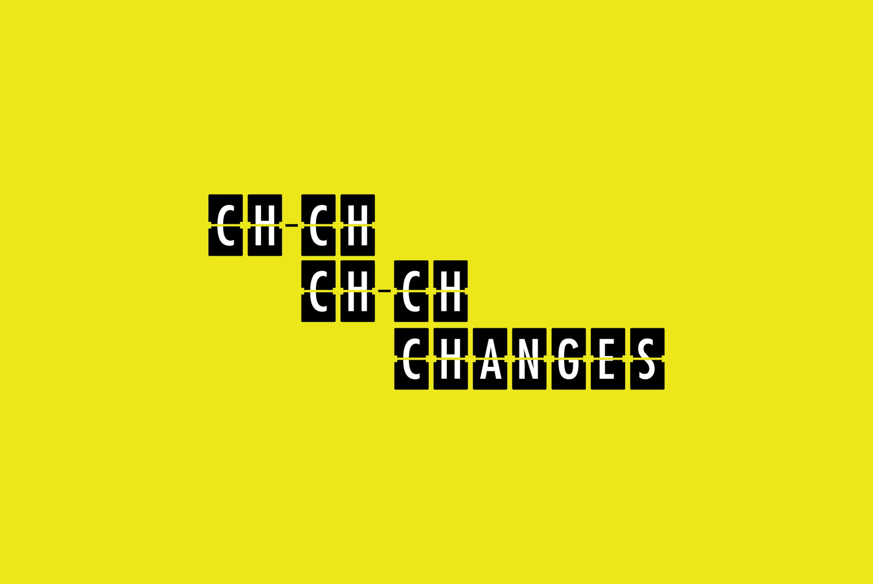
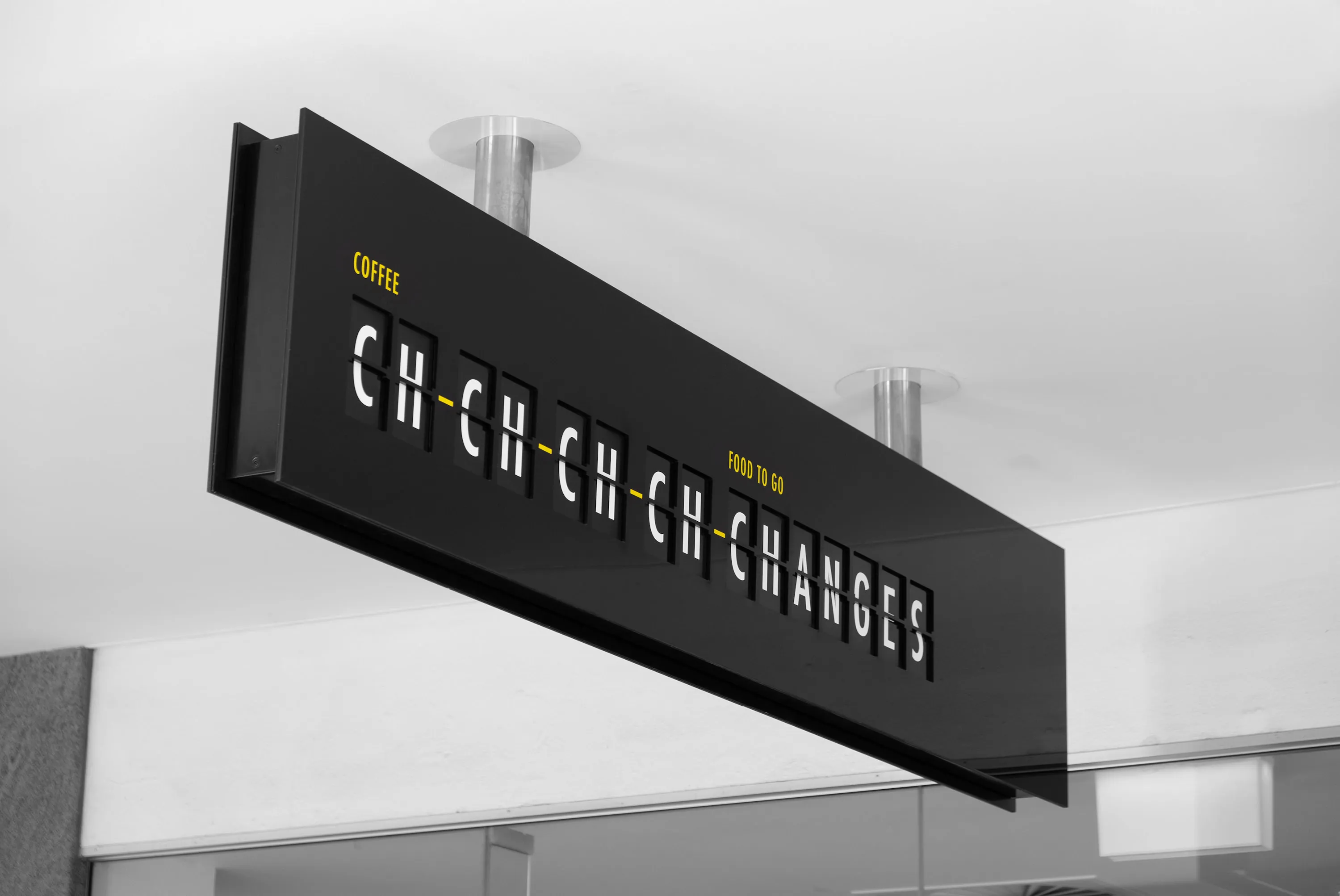
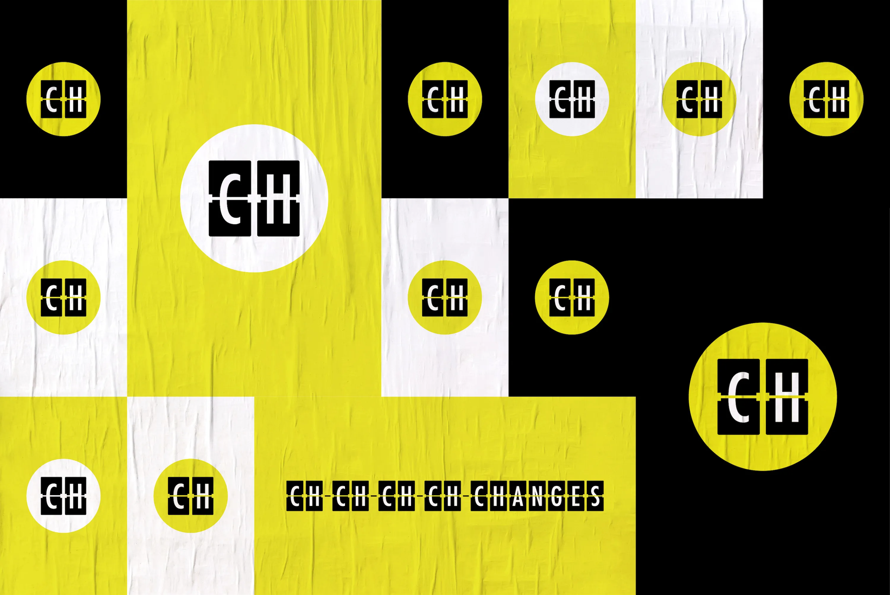
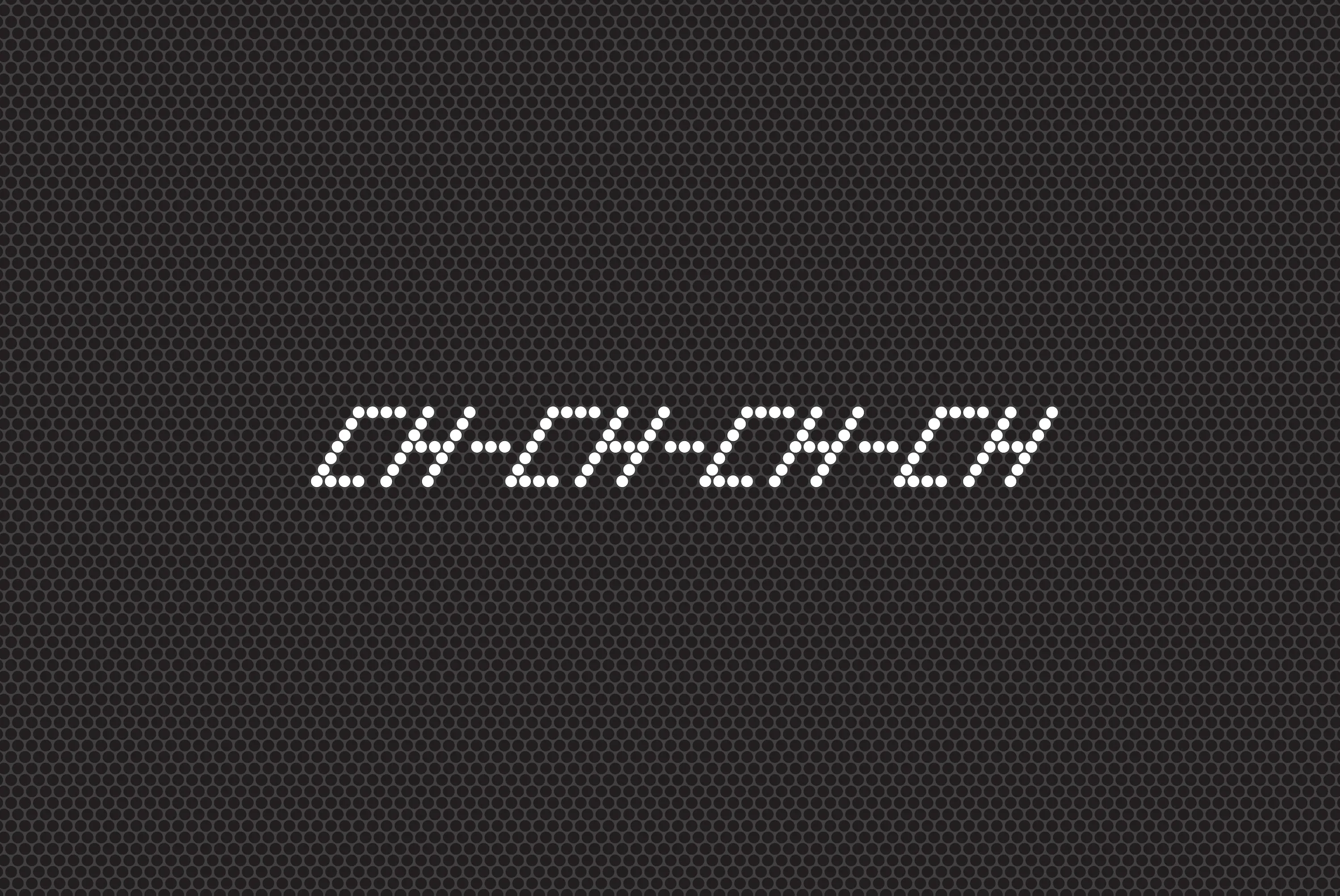
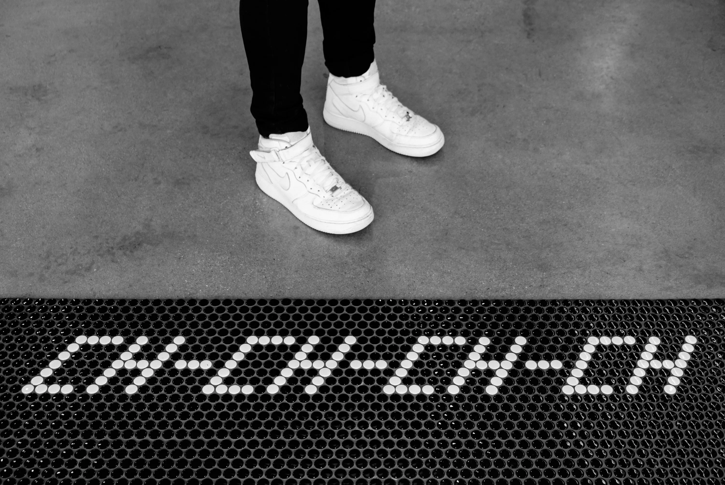
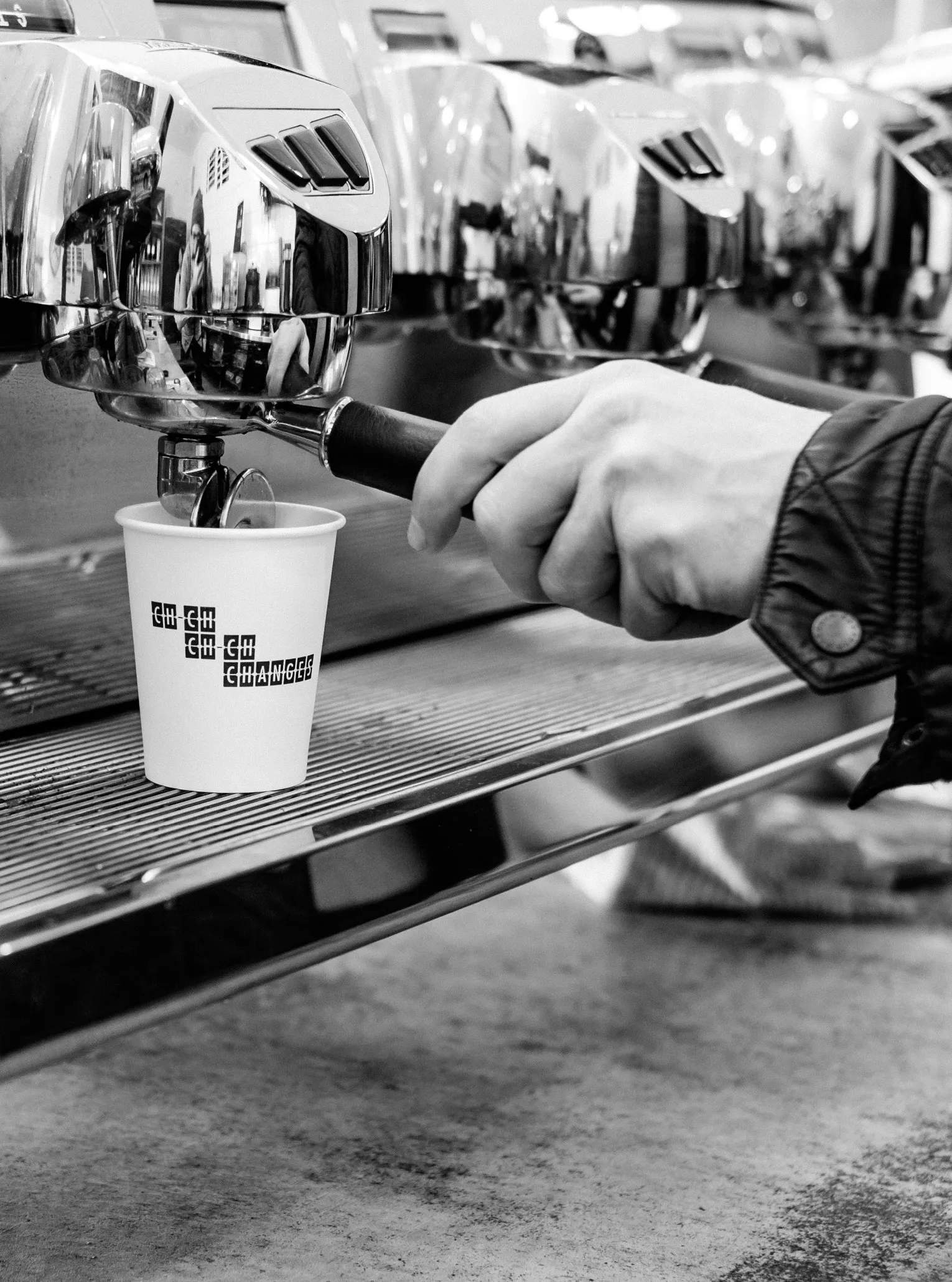
Ch-Ch-Ch-Ch-Changes
A café brand for the daily commuter.
- Industry
- Hospitality
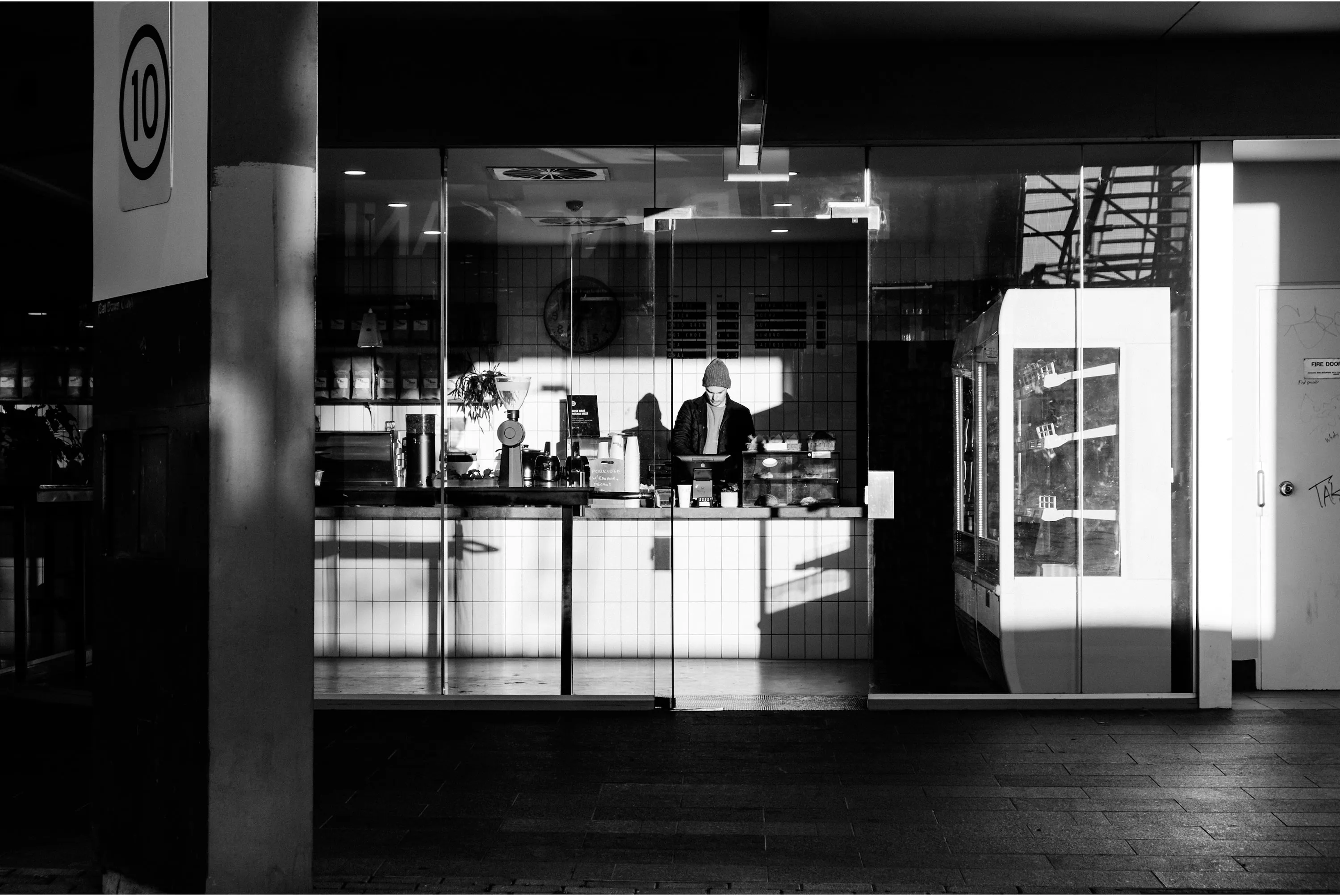
Based in a bus interchange, Ch-Ch-Ch-Ch-Changes is a welcome addition to the bustling urban commute—a cosy haven to press pause and pick up a quality cup of coffee.
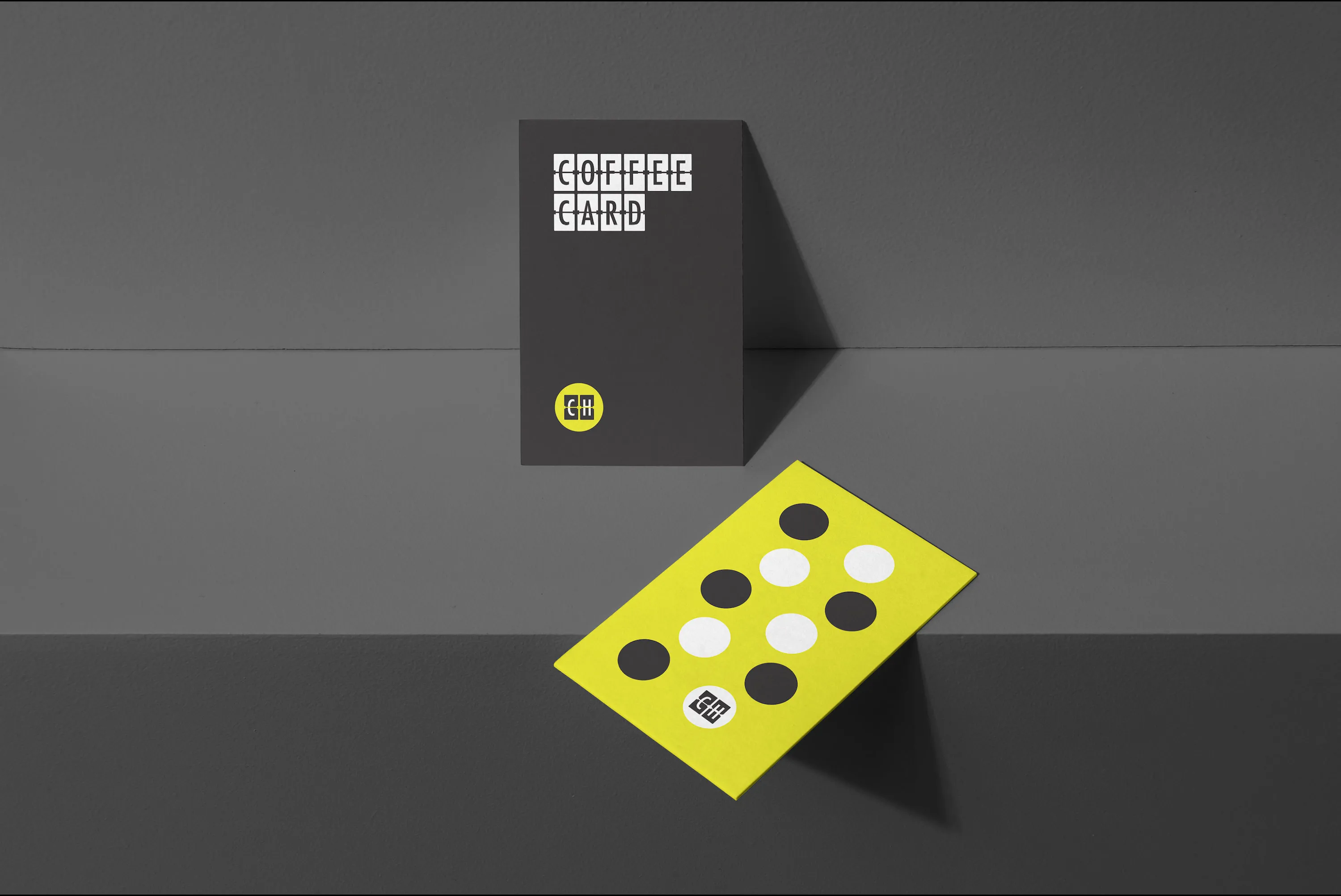
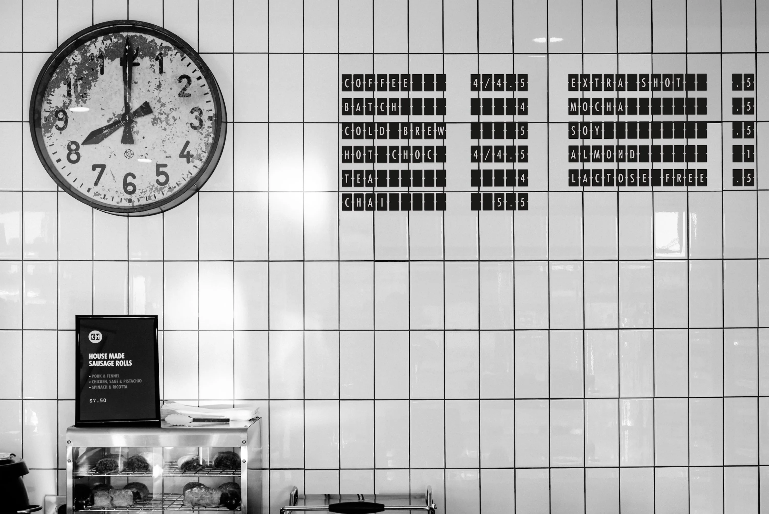
The graphic language system takes inspiration from the ‘clicky-clacky’ analogue split-flap displays found in transport hubs of yesteryear. The brand identity expression across collateral and signage design closely reflect the vision for the interior, and the clients love affair with the lyrics of David Bowie. The interior signage considers how the visitor will interact with the brand as they go on their daily commute, with a welcoming motif of penny rounds and a no-fuss menu mounted to an appropriate use of subway tiles.